
CRO for Service Businesses That Book More Qualified Calls
Service businesses do not lose revenue the way ecommerce stores do. There is no abandoned cart full of SKUs. There is a quieter failure: a visitor lands, skims...
Read article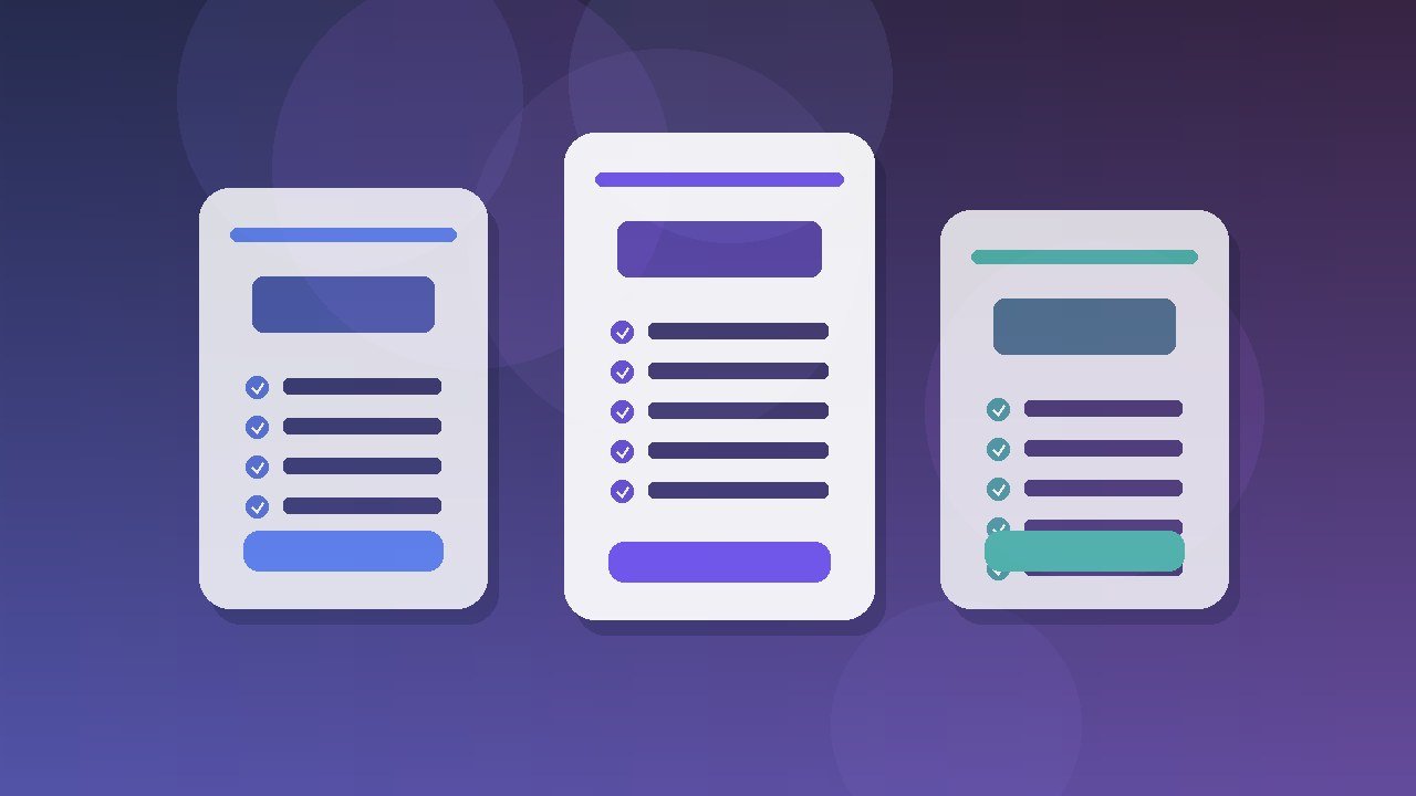
A pricing page is not a spreadsheet with nicer fonts. It is the moment a buyer decides whether your offer feels fair, clear, and worth the next call. When that page confuses people, they do not email you for clarification. They leave, open a competitor tab, and tell themselves they will come back later. Most never do.
Teams treat pricing as a design chore: three cards, a toggle, a comparison table, done. Buyers treat it as risk assessment. They scan for who the plan is for, what is included, what is excluded, how billing works, and whether choosing wrong will waste money or lock them into the wrong path. If those answers are buried, the page fails even when the product is excellent.
This guide is for founders, product marketers, and agency operators who need a pricing page that converts without turning into a maze. You will get a practical diagnosis of why pricing pages fail, an information architecture that matches how buyers decide, naming and comparison patterns that reduce cognitive load, annual versus monthly framing that does not feel manipulative, social proof and FAQ placement that removes real objections, caution around A/B testing, accessibility and mobile clarity, and a clear signal for when to rebuild with a partner like SquartUp instead of shipping another half-finished template.
Most broken pricing pages share the same root problems. The offer is unclear. The plans are named for internal teams, not buyers. Feature lists mix different levels of abstraction. The recommended plan is not actually recommended with a reason. Legal and billing details appear only after someone clicks through to checkout. And the page tries to sell every persona at once, which means it sells none of them well.
Confusion is expensive because it looks like soft interest in your analytics. Sessions bounce. Time on page looks healthy because people are hunting for answers. Demo requests drop. Sales hears the same questions that the page already tried (and failed) to answer. Leadership then asks for a redesign, and the redesign often repeats the same structure with better shadows.
Start by listing the questions a first-time visitor must answer in under two minutes:
If your page cannot answer those without a sales call, you do not have a conversion page. You have a brochure that creates sales debt.
Designers often open Figma first. Operators should open a map of decisions first. A strong pricing page usually follows a short sequence: context, recommendation, comparison, proof, objections, and next action. You can rearrange the visual layout, but the buyer still walks that mental path.
Context states who pricing is for and what buying unlocks. Recommendation names the plan most buyers should choose, with a plain reason. Comparison gives careful buyers structured detail. Proof and FAQ sit near doubt. The next action stays consistent across cards. Link out to feature, security, and implementation pages instead of packing every surface into one URL.
Use a predictable order so returning visitors and new visitors both orient quickly:
If you sell custom services rather than seats, keep the same skeleton and replace seat math with engagement shapes: discovery sprint, build retainer, growth partnership. Buyers still need ladders, not a single opaque quote form.
Internal names leak onto pricing pages all the time. Starter, Growth, and Enterprise are fine when the differences are obvious. They fail when Starter excludes the one feature that made the buyer show up, or when Growth is really Enterprise with a friendlier word. Name plans for the job, the stage, or the operating model the buyer already uses.
Good naming patterns include:
Bad naming patterns include clever brand puns nobody understands, internal package codes, and names that imply quality ranking instead of fit. Calling the middle plan Pro can work. Calling the cheapest plan Basic can quietly shame the buyers who should start there. Prefer honest fit language over prestige language.
Write a one-line audience descriptor under each plan name. Example: For product teams shipping their first customer portal. That single line does more conversion work than five feature bullets because it helps people self-exclude fast. Self-exclusion is healthy. Confused exclusion is not.
Comparison tables help when they answer a small set of meaningful differences. They hurt when they list every checkbox in the product. Buyers want to know what changes between plans in ways that affect risk, cost, and capability.
Group features into decision categories: access and seats, core workflows, collaboration, integrations, security and compliance, support and success. Show rows that actually differ, plus a short shared-essentials note above the table. Use consistent units. Prefer checkmarks for binary capabilities, numbers for limits, and short phrases when quality differs.
Highlight the recommended column with a quiet badge, subtle border, and a commercial reason line. Example: Most growing teams choose Scale because it unlocks shared workflows and priority support without Enterprise procurement.
Leave marketing slogans out of comparison rows. Leave experimental features out unless they are sold. Leave legal footnotes in FAQ or linked terms, not as dense underlines inside every cell. And leave vanity metrics that do not change the purchase decision. If a row does not help someone choose, it is noise.
Annual discounts are normal. Dark patterns are not. State both prices clearly. Show the effective monthly cost of annual billing. Show the absolute savings in currency, not only a percentage. Make switching paths obvious. If annual is default, say so and let people flip to monthly without hunting.
Buyers punish clever defaults that hide higher spend. They reward honesty that still makes the better commercial choice attractive. A clean pattern is: billed annually (save 20%), with the monthly equivalent under the big number, and a toggle that recalculates cards immediately. Avoid tiny strikethrough games that make people feel tricked.
For services and retainers, the equivalent choice is often prepaid quarters versus month-to-month. Same rules apply. Explain what the buyer gains with commitment: reserved capacity, better rate, or priority scheduling. Do not invent scarcity. Real capacity constraints can be stated as scheduling facts.
Social proof too high on the page becomes wallpaper. Social proof too low never gets seen by undecided buyers. The useful placement is near the recommended plan and again near FAQ, with different jobs for each block.
Near the plans, use short outcome proof: We cut quote turnaround from five days to same-day for a mid-market manufacturer. Near FAQ, use trust proof: security review notes, onboarding time, or implementation partners. Logos help when they match the buyer segment. A wall of mismatched logos can signal that you take anyone, which is not always a compliment.
Quotes should sound like operators, not brochure copy. Specific beats glowing. Numbers beat adjectives. Role and company size help more than a headshot when privacy or brand guidelines limit what you can show.
Pricing FAQ is not a place to restate your homepage. It is a place to answer the awkward questions sales already hears every week. Mine call notes and ticket tags. Then write answers in plain language.
High-value FAQ themes for B2B pricing pages include:
Keep answers scannable. Lead with the direct answer in the first sentence, then add one short clarifying paragraph. Link to deeper docs for edge cases. If an answer requires a sales conversation, say that and provide the right CTA instead of pretending self-serve covers everything.
Pricing pages attract endless experiment ideas. Some are worth running. Many are not. Unclear messaging will not be fixed by button-color tests, and wrong packaging will not be fixed by a greener CTA.
Test only after a coherent baseline exists: plan fit lines, honest math, a recommended plan with a reason, and FAQ matched to real objections. Then change one meaningful lever at a time, such as recommended plan position, billing default, or demo versus self-serve for mid-tier.
Watch for false wins that raise checkout clicks while increasing refunds or support load. Align metrics with the business model. On low-traffic B2B sites, interviews and win-loss notes often beat a noisy multi-variant calendar.
Clarity is not only a writing skill. It is an accessibility and usability obligation. Low-contrast price text, tiny footnotes, color-only indicators for included features, and hover-only details all create avoidable friction. Buyers using keyboards, screen readers, or bright outdoor screens still need to compare plans.
Practical standards that help everyone:
If legal requires disclosures, place them where they are readable. Hidden compliance text is still a trust problem when someone finds it later and feels misled.
Many first visits still happen on phones, even when purchase closes on desktop or with sales. Common failures: cards without a clear recommended path, tables that demand horizontal scrolling, sticky CTAs covering content, and toggles that reflow so hard people lose their place.
Design mobile as its own path. Lead with the recommended plan and a jump link to full comparison. Let other plans expand in place. Prefer a plan picker that filters columns over dense multi-column tables. Keep primary CTAs thumb-reachable without hiding monthly or cancel options. Test on real devices and watch where one-handed users hesitate.
Productized services need pricing clarity too. Many agencies hide everything behind Contact us, then wonder why inbound quality is uneven. You do not have to publish exact retainers if your market is negotiated. You do need ranges, engagement shapes, and what is included at each altitude.
A services pricing section can show three engagement models with starting ranges, typical timelines, and ideal client profiles. Pair that with a short note on what moves a project into custom scoping. Buyers who are a fit will self-qualify. Buyers who are not a fit will stop wasting your sales calendar. That is a conversion win even when the form-submit count stays flat.
If you sell both product and services, separate the paths visually. Mixed CTAs like Start free and Book a rebuild strategy call can coexist, but each card should own one primary action.
Rebuild when the page has become a museum of old packaging. Signs include plans that no longer match how sales sells, feature tables that contradict the product UI, discounts that finance no longer supports, and FAQ answers that the success team has rewritten in email templates three times. Another sign: your team debates button copy while still unable to explain plan differences in one sentence.
A focused rebuild is usually a messaging and information architecture project first, then a UI project. The partner should interview sales, success, and a few recent buyers. They should map objections, rewrite plan fit lines, simplify comparison groups, and only then redesign cards and components. Visual novelty without packaging truth is expensive theater.
Choose a partner who can connect positioning, UX, and implementation. SquartUp often approaches pricing and packaging pages as commercial systems: clearer offers, cleaner decision paths, and front-end work that stays fast and accessible. That mix matters because a beautiful page that confuses checkout math still loses money.
Use this checklist before you call the page done:
If you cannot check most of those boxes, pause the visual polish and fix the decision system first.
Retire infinite plan proliferation. Retire feature rows that exist only to make the expensive plan look busy. Retire contact-us-only pricing when your ICP expects self-serve education. Retire fake countdown scarcity on evergreen plans. Retire tooltip walls that hide critical limits. Retire different CTA labels on every card that send people to the same form with no plan context. Pass the selected plan in the URL or form field so sales is not guessing.
Also retire the habit of updating pricing in three places: the page, the checkout config, and a PDF sales send. One source of truth prevents embarrassing mismatches that destroy trust in the final mile.
Three is the default for clarity. Use two when your offer is genuinely simple. Use four only when a distinct usage rung is required and you can explain it instantly. More than four usually means packaging debt.
Often yes, but still show what Enterprise unlocks. A blank card with no detail trains buyers to assume secrecy. Give enough substance that procurement knows why the conversation is worth scheduling.
Publish ranges and inclusions when the market allows. If competitors are opaque and your buyers are enterprise, a scoped conversation may be right. Even then, show models and starting expectations so the page educates.
Bring sales into the rewrite and trade a long table for better discovery questions and a sharper recommended path. Sales wins when inbound is clearer, not when the page is a catalog dump.
Change when packaging, costs, or ICP shift. Avoid weekly cosmetic thrash. Buyers and sales both need a stable story. Schedule packaging reviews quarterly, with emergency updates when product reality changes.
A converting pricing page respects the buyer’s risk. It names who each plan is for, shows honest numbers, compares only what matters, places proof where doubt peaks, and answers objections without theater. It works on mobile. It stays accessible. It matches what sales and delivery actually do after the click.
If your current page creates more questions than qualified next steps, you do not need another round of decorative iteration. You need a clearer offer architecture and a page built around how buyers choose. Start with the decision map, rewrite the plan stories, simplify the comparison, and ship a page that helps people say yes with confidence or opt out without resentment. Both outcomes are healthier than confusion.
Treat pricing as product work, not as a poster. That is how pricing pages stop confusing buyers and start doing their real job: turning interest into clean, durable revenue.

Service businesses do not lose revenue the way ecommerce stores do. There is no abandoned cart full of SKUs. There is a quieter failure: a visitor lands, skims...
Read article
Franchise and multi-location brands rarely fail because they lack a homepage. They fail because every location becomes a miniature marketing team with different...
Read article
Agency launches fail SEO in a quieter way than most postmortems admit. The homepage looks sharp in the client walkthrough. Lighthouse is green on a quiet stagin...
Read articleTell us about your project. We will scope it honestly, propose a clear timeline, and show you how we have helped companies like yours ship faster.